There is a popular term called ‘above the fold’ which is used in the website world. What is it and how could it change how you look at your website? Read on! Already know about above the fold? Read on and see if you are maximizing your use of this prime website real estate. What Is Above The Fold?
‘Above The Fold’ was originally a newspaper term. When you see a newspaper for sale on a rack, it is folded in half with the top half showing just enough information to get people to buy the paper as they walk by. That’s why when you see your favorite print newspapers, they have interesting headlines, a gripping photo, and teaser information about inside features on the top half of that front cover.
In the website world, ‘above the fold’ is the part of the website that visitors see before they begin scrolling. There are two things you want to give your visitor on this critical piece of real estate:
1) Navigation- a way (or ideally multiple ways) to get to the information they may need.
2) Calls to action- actions you want your visitor to take.
Let’s look at these in isolation then together.
Navigation
When someone gets to your website, it’s like they are walking into a new building. They immediately begin looking for ways to get to information they may want or need: signs for directions, a ‘You are here’ map, a floor plan, a concierge. Here are a few ways to navigate users to information:
- Site menu- To save space, many companies use their big ideas as menu items and let visitors navigate to submenu items via dropdowns.
- Search box- Users can type in a keyword or phrase to get to the part of the site they need.
- Slideshow or gallery- Slideshows of images allow for a more beautiful and dynamic page but also let people discover content on the site. Usually clicking on the image will take you to that content.
Calls To Action
In the ideal world, you want a visitor to do something when they get to your website besides read your information. It might be:
- buy your product
- follow you on social media
- subscribe to your blog
- download your ebook
and lots more potential examples!
These are called ‘calls to action’ because they ask a visitor to do something besides view a bunch of information... and by doing this, you can capture their information to begin building the relationship or make money on the spot.
Let’s look at some website above the fold examples:
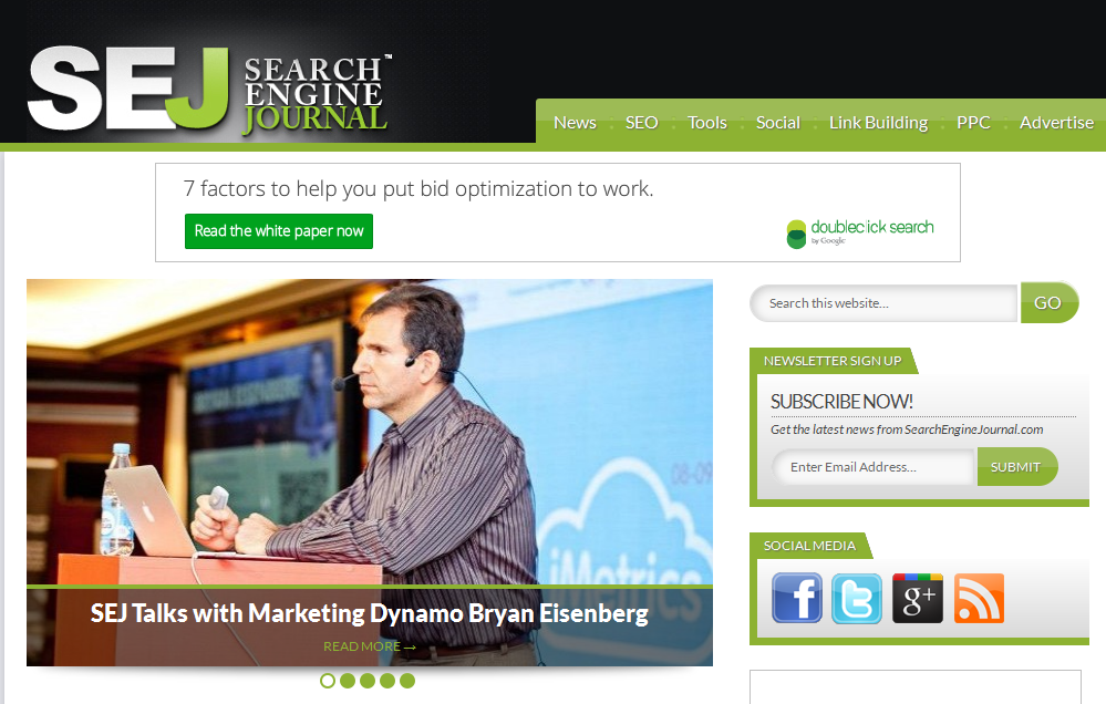
SearchEngineJournal.com

In addition to getting calls to action and information navigation, SearchEngineJournal is also able to offer a premium ad space to an advertiser, helping them generate revenue.
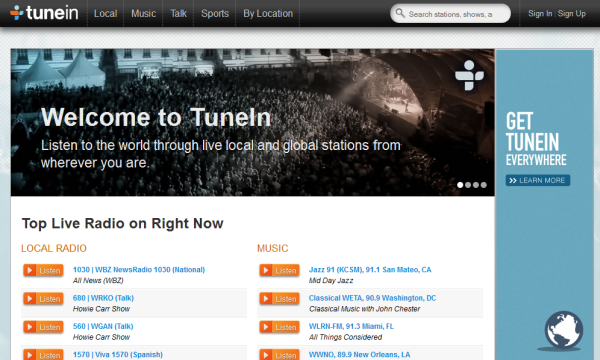
TuneIn.com

Because this website is for an app, the download button is prominent. The mobile version above the fold gives you the choice of downloading the app or continuing to the regular website.
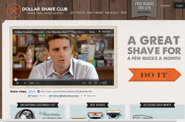
DollarShaveClub.com

How Can I Do Better ‘Above The Fold?’
Ask yourself a few questions as you look at your website.
1) How are you helping people navigate to the information they need?
Some people enjoy using search boxes, others appreciate a menu or site map to see how the information is organized. Give your visitors a choice as to how they find information.
2) What are you asking them to do when they get to your website?
You can’t ask people to do twenty things but you can ask them to do two or three. Make sure the calls to action you feature are your most important.
3) Are you trying to do too much above the fold?
While this spot on a website is great to utilize, don’t try to do too much above the fold or risk overwhelming your visitors.

Follow