 Are You Off Color?
As a schooled graphics and Joomla web designer I have learned first hand that the colors you choose for your branding can really make or break you. It’s true that color choices are highly subjective, yet there are some fundamental choices that are viewed as ugly or inappropriate by an agreeable majority. Taking this reality a bit further, it is safe to assume that the colors you choose may not be appropriate to your audience or industry.
You have to choose colors that best project your industry and best convey the right message to your audience. For example, if you are a travel agency, you may not want to use too much black but instead use dark blue or dark green, etc. to coincide with outdoors. Keeping in mind that light shade of a color vs. the dark shade of a color can also impact your message. Pastel colors may seem relaxed and soothing, but can also backfire and give a wishy-washy impression if used in the wrong industry type or audience. The combination of light and dark also play a part. Too much use of light or dark can dilute your message or brand. For example choosing the shades of one color is more acceptable (black, grey, silver) than a mix of shades from more than two color groups.
Usually, professional services should have a strong color choice to project an objective, firm “we get the job done” attitude. A washed out light color will give an impression of uncertainty and unsure attitude. For example, a light color theme may not work well for legal professionals – but may work well for healthcare professionals who need to portray them as very caring.
If your website is a CMS and you are using a template, you may have a shortcut or a cheat way to get your colors coordinated. As a Joomla website designer, when I choose a Joomla design template, I look for one that best represents the industry style I’m working on, then I choose the best color combination that the template offers for my Joomla website design theme. The idea here is to match my branding colors from the template. As WordPress and Joomla web designers, we are very fortunate in that there are literally thousands of templates for us to choose from that offer infinite combinations.
The reason why this works well is because professional WordPress and Joomla web designers that create these templates choose their color pallet from harmonious swatch groups and themes. Following their color choices keeps my Joomla web design within the proper color group. For example, their blue and red work well together on their Joomla design sample, whereas, your blue and red may clash and make your Joomla website look amateurish.
Are You The Right Type?
You have probably seen graphics that seem as though they were created in the fifties compared to others that look as fresh as “today”. Often times it is the style of shading and type fonts used. A retro font automatically looks like a throwback whereas a tech font may not. Use the typeface that best matches your industry type. A high tech manufacturer may not be well served with a nineteen-sixties looking font. This is common sense but if you search you will be surprised how often this is overlooked.
Font and style of graphic is probably the single most important element that gives your brand its unspoken personality. This is obvious when you visit any WordPress or Joomla web design template service. Without reading the words or letters, the font style they use immediately speaks volumes about what that template is about and what industry it is in. Visually it lays the groundwork for your message. As a Joomla consultant on custom Joomla design, I find referring clients to these template services a good part of my client introductory exercise. By looking at the variety of industries and designs represented, clients can quickly get a sense of where the current styles are and the type of style and design they will need to consider before they actually hire my Joomla web design service.
Choosing the right style for your Joomla web design is extremely important and needs great attention on your part. Your success or disaster starts right here. How well you integrate your branding via your template will have a significant impact on your future. If you’re not sure about this, seek professional help. Don’t kill your business with the wrong style, typeface or color. Hire a professional WordPress or Joomla web designer so you don’t wing this.
Are You A Backwards Thinker?
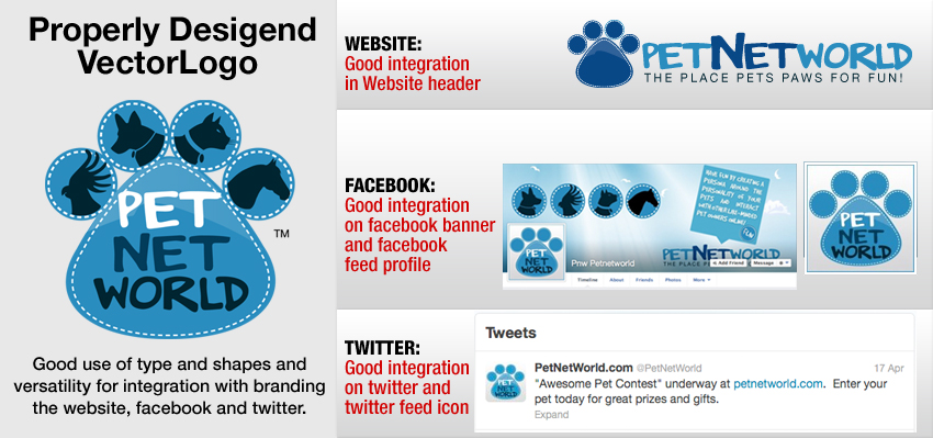
When branding, it’s best to think backwards. Think of all the places you need to be in the future first, and then think backwards to what you need now. Whether you are using a custom Joomla design or using a template, you will have places where your logo or brand will need to fit (physically and graphically). This also applies to other web properties (especially in social media). Facebook has different size requirements than Twitter, Google, LinkedIn, YouTube, etc. Will your logo design work well in those spaces? Does your brand include elements than can be used separately on those channels? Is your brand mainly made up of text that has to be read to be understood?
A good Joomla consultant or Joomla designer will point out these pitfalls before you spend a dime. They should help you define a good shape for your brand that will help you when you need to port your identity to other platforms. If your criterion is only on what looks good on a business card, or print, you will eventually box yourself in a design corner.
Make a list of all the places your identity will most likely be used and base your ultimate design decision and approval on that. What do you need to accomplish in the next 2-5 years? A good Joomla designer should be able to steer you in the right direction.
As with any branding/logo, the time will come to when it will need to be freshened up. This may be quite easy to do for your commercial Joomla website template which in many cases only takes a few clicks to swap out the old with the new. It will not be as easy if you have a custom Joomla designed template. Harder still, will be your logo if you have not been keeping it fresh all along. If you waited too long between freshening your brand image, you may have some major work ahead of you to preserve and update your image at the same time. It takes a sharp eye to keep these changes subtle and effective at the same time.
It’s smart to make small adjustments to keep the shape and design performing during long periods. Pay strict attention to the “freshness” factor. Ask yourself this; is your brand image starting to show some age? This could happen in as little as six months. Don’t be afraid to make minor adjustments as time goes by. It is almost certain that your branding will age and will look tired sooner than you can imagine.
Making small periodic adjustments will prevent you from having to do a noticeable overhaul. Pepsi is an excellent example of this. It has taken them 50 years to evolve their logo into a few colors and shapes.
Branding logo using shapes and colors for diversity and longevity.

Are You Left or Right Footed?
Starting on the right graphical foot means never having to say “I’m Sorry”.
Never use a photo inside your logo or build your logo around an image. There are two major reasons for this. First, you are starting from the wrong end of the design chain. Your logo should first be designed using a vector-based editor. These days, Adobe Illustrator is the best tool to accomplish this. If you are unfamiliar with Adobe Illustrator, you are back to plan A (hire an agency) as this application has a steep learning curve. Unless you are skilled at using Adobe Illustrator, I can guarantee your efforts will be a complete waste of your time.
Vector graphics can scale to any size and are resolution independent. This means they will look sharp no matter what screen or print device you use. Because the image is constructed using a mathematical programmic language (encapsulated post script -EPS) language, they are rendered at the maximum available resolution independent of the output device, a screen or printer. Therefore, starting with a vector graphic allows you to go anywhere, scale to any size, adapt to any environment. It will also allow you to export to any format you will ever need.
A logo designed in vector graphic can downs-ample to any size .jpg, .pdf, .tiff, .psd, .png, etc. But a logo constructed in these latter formats (bit-mapped) loses the option of scaling upwards to .eps. This means your options are better when you start on the top of the graphics chain where you can always work down as needed. Start on the right foot. If you need an image in your logo, you don’t have a logo you have an image.
As time goes by, you will develop a better sense of what is working and what is not in your branding campaigns. When thinking backwards, think about shape, color and style first then worry about the actual graphic element. Size matters. When thinking backwards, think about your Joomla web design template… do you have enough room in your template for your brand image? Will your image show well at that size in your color?
Remember branding ages with time and a custom Joomla design template may need frequent tweaks to stay fresh… so be prepared for that from the start by using well defined lines and shapes that can be easily updated within your template without losing your original identity. Don’t forget to stand back from time to time and re-evaluate your brand’s appearance. Curb appeal is not just for real property but also applies to web property.
Happy Branding!

Follow