Joomla CMS Site Owners Here is Your Branding Test Strip:
If you want to have the best CMS presentation and online marketing program for your online and offline business you need to start with having a strong brand identity. Everyone wants their brand image (logo) to look professional, get noticed and be memorable… but not everyone pulls that off! That is a tall order and millions attempt this feat each year. Although it sounds easy, it isn’t, especially if you already have some type of branding that is not working well for you… in which case you might consider re-branding. But re-branding is like rewind, so you may want to weigh the consequences of having to revisit all your existing marketing materials.

In cases where your branding has been a complete failure it is crucial to start from scratch. This could be extremely painful but necessary. Hopefully you are not in that predicament and you are just looking for some good advice on starting your branding strategy or making it better.
Before you start, understand that branding is one of the most important things you will ever do for your company’s long-term growth. How you choose your branding will impact the future of your company, service and products.
So where do you begin if you are just starting to think about branding or are considering re-branding?
The best option is to hire a good design and marketing company. Make sure to hire a company that has a head for marketing. Hiring a design group only, may not be the best option because they tend to be too narrowly focused because they are not marketers and spend too much time in the design space. Design only agencies often miss marketing changes and needs and may not necessarily give you the best results for real world applications. They also tend to design more for style rather than your company’s statement or message.
If your budget is not quite up to an agency tab, consider plan B, doing it yourself or calling a friend or family member with graphic skills. This is not a good option but if you are strapped for funds it may be your only choice. You may save money but it is almost a guarantee that you will waste more time and end up with less than optimal results.
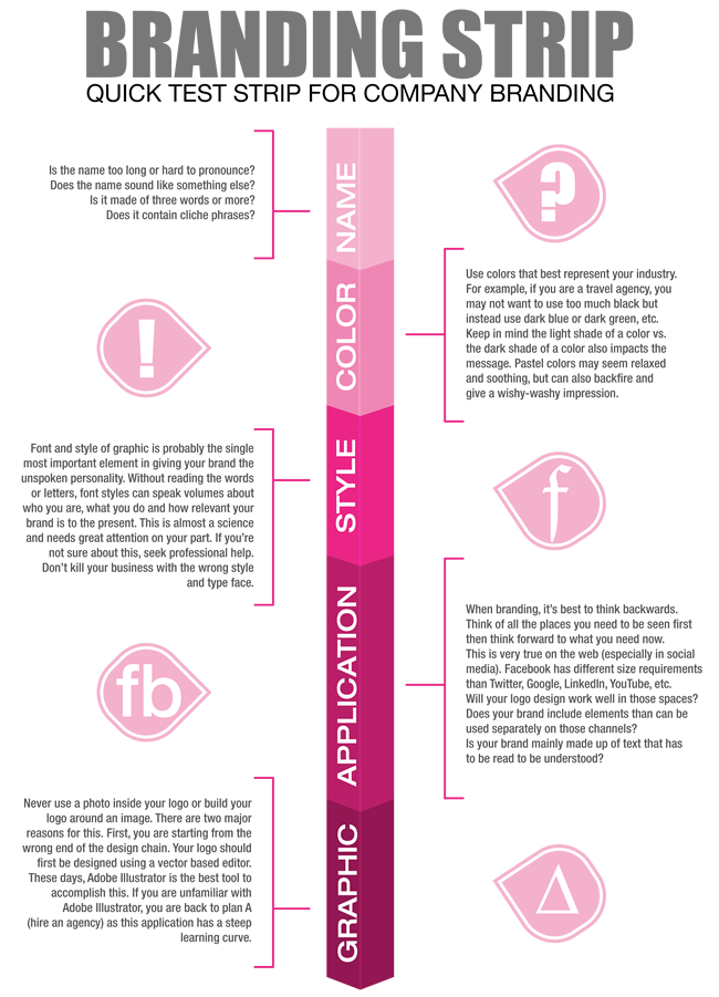
If you opted for plan B – doing it yourself, here is a quick strip test to use so you don’t overlook important considerations.
How’s your name?
The name you choose will greatly impact what your brand image will look like. If you haven’t picked a name yet, then there is time to really think this through graphically. How will the name look in lights? On a header, on a web page, on a business card, on a flyer, on a poster, on a billboard, in an email, in your newsletter, or even stamped on your shirt. Whatever you choose will need to be flexible in all these arenas and more. You will need to mentally visualize your logo in all these different venues. If you can’t see it working in any one of these applications, then it most likely is not your best choice. Your logo needs to be like a Swiss army knife.
If you already have a name, let’s move on to how to make the best of it.
 For starters;
- Is your name too long or hard to pronounce? (ie: Boehringer Ingelheim)
- Does your company name sound like something else when pronounced? (ie: Ben Dover Inc.)
- Is it made of three words or more? (ie: Ace Imported Power Drills)
- Is it hyphenated? (ie: Goldfish-Heaven)
- Does it contain uncommon words (ie: Accoutrements)
You can still use names like the examples above, just know that it will rear its ugly head at some point and you will pay for it. Stay clear from the beginning. Make choices while you still have that choice and before you invest marketing juice.
These are just a few things you will need to think about when deciding on a name and how it will display or be read in public. Keeping it short helps memory and visual retention for your brand. Too many words and letters will make for a sloppy presentation. A busy name will greatly decrease the ability of your brand to be read properly when displayed in small areas. If your name is too long consider only using the letters. It’s easier to remember IBM than it is to remember International Business Machines – It’s also much easier to logo IBM.
Long names don’t work well.
Short names work best.
If you are stuck with a long name, try using the letters inside the logo and writing out the name as a line under the graphic. This way, you will still be able to use a sharp logo/graphic in places that require sharp distinct shape (the smallest of these is probably the favicon for your web page) and still use the second image (with the company name spelled out) in places where that works best. This strategy allows you to make the best of your situation.
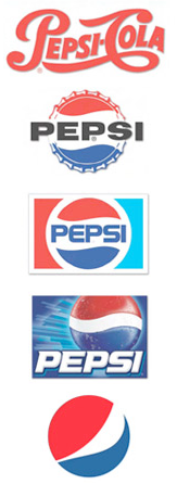
You don’t have to disclose everything your company DOES or everything your company IS. A little mystery goes a long way. As in the case of Pepsi, they have totally stopped using their name with their logo. Over the years, Pepsi has managed to get those wavy stripes recognizable as their brand without the use of type.

Follow